
So now we are four weeks into the course, this being my second post, and I’m slowly losing my mind. This week we have our Alpha presentation, and these four weeks of work will be shown in front of the class. Hopefully everything goes well, and hopefully this artifact I’ll be talking about this week will help completing the things we need for this phase in production.
This week’s chosen artifact is the creation of mechanic indications on the ship. The reason why this is important, is because we are trying to go for a really minimalistic HUD for the game. This to immerse the player more in the game-play, and create the atmosphere we want. So the indicator, for example, life, will be shown in some way on the ship. And the selection of the different weapons and how much overcharge (a game mechanic) you have currently. So let’s go through the ones I’ve made and what they are for.
As I said before, we will not be showing a life counter on the screen. But your life will be shown in some way shown on the ship. We decided that this should, of course, be shown by visual damage on the ship. The ship would have three different stages of damage.
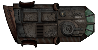
After taking 1/4th damage of it’s health the ship would be slightly damaged. I made this visually so that the ship would look roughed up, scratched and dusty. I created this by making a new layer and just going nuts with brushes in different tones.
After receiving more blows and when the ship’s health is about 2/4th gone, the ship will receive more visual damage and start to smoke and throw sparks. The effects of smoke and sparks was made by my fellow graphical artist Oscar. But the ship damage I designed. So I showed this visually by making large holes and cracks in the hull and making the front window of the ship cracked. 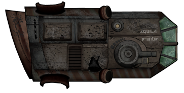 The cracks was created by first making a shape out of black color. I then outlined this with a gray color and then a really light gray. This made it look like it had depth.
The last visual indicator on the ship and when it’s in critical condition, is that the lamp (the one I created last week) will start to flash red. At this point, if the ship receives more damage, it will crash and blow up. This blinking of the lamp will be added in as an effect in the engine, so I didn’t have to make an animation for it.
More then damage indicators, I’ve also made a bar for overcharge and an indication for weapon selection. The overcharge bar would show how much overcharge the player currently have.
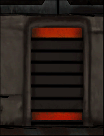
To show the power increasing, the bars would go up and also change color from red to green, to really show when it’s ready for use. This was later changed though so the bars would start at the bottom and the top to later meet in the middle. I did this so the player could read the power bar even if the ship was upside-down.
The weapon selector was also needed as the ship would later have multiple of different weapons they could switch between.  So to be able to track which weapon is selected, it would need an indicator. So I made a small bar next to the weapon, that would fill up and glow every time you would select it.
And so these are some of the indicator that are now finished for the alpha. Hope you’ve enjoyed reading my ramblings, and have a nice day!!

Hi Amanda!
In the blog you describe your working process well, you explain within what frames the artifact should be created and how you made it. You also explain your decisions but not all of them, it would be interesting to hear your thoughts on the weapon switching lights. Are there as many weapons as the weapon bar contains lights or is there one of these lightbars at each weapon?
I think the implementing of the HUD onto the avatar is a neat but also hard thing to do. I don’t know how large the avatar is but I guess there are some problems with making the meters visible enough?
The visuals of the deterioration, looks very nice and realistic. The tear is seen on the middle of the ship but shouldn’t there be some buckles on the edges? I can see how a change of silhouette could interfere with code or other art assets and understand If you don’t want to change it. But I also think that a silhouette with a lot of buckles, tear and scratches could provide a more convincing deterioration.
It will be interesting to see the Aquila with all bars and lights attached in the beta playtesting. Well done this week and good luck on your future work.
-Nils Folker, group 10
LikeLike
Thank you for your feedback 🙂
LikeLike